


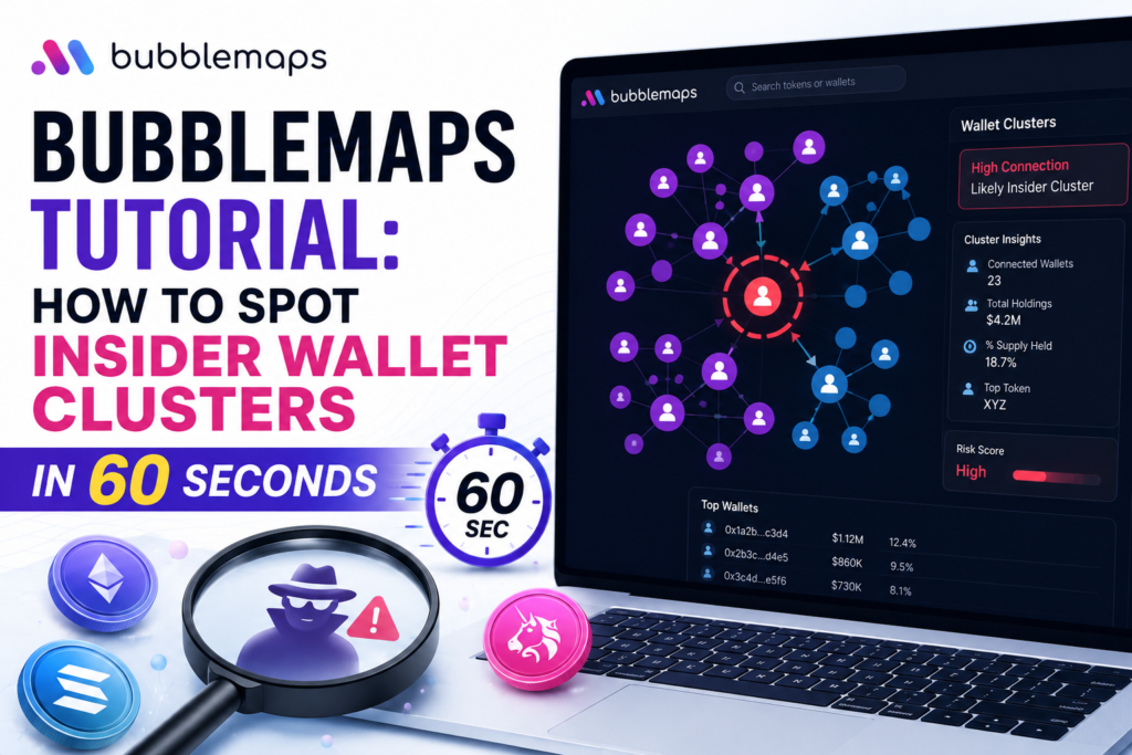
You’ve been there. A token launches, the chart pumps, the Telegram is on fire, the KOLs are tweeting and then, three hours later, it dumps 80%. You check the on-chain data afterward and find exactly what you suspected: five wallets holding 60% of the supply, all connected, all bought at launch, all sold into your face.
The painful part? That information was right there the entire time. You just didn’t look at it the right way.
That’s what Bubblemaps exists to fix. And in 2026, it’s become one of the fastest, most accessible tools for catching insider wallet clusters before they catch you often in under 60 seconds.
This guide walks you through exactly how to use it.
What is Bubblemaps and why does it matter?
Bubblemaps is a blockchain analytics platform that converts raw token holder data into an interactive visual map. Instead of scrolling through thousands of anonymous wallet addresses on a block explorer, you see an immediate picture of who holds a token, how those wallets are connected, and whether the distribution looks healthy or engineered.
The core concept is elegant. Every wallet holding a token becomes a bubble. The size of the bubble reflects the size of the holding big holder, big bubble. The lines connecting bubbles represent transfers between wallets. When multiple wallets are densely interconnected with each other, that cluster is almost always controlled by the same entity.
Founded by Nicolas Vaiman, Arnaud Droz, and Léo Pons, Bubblemaps has become a staple tool for memecoin traders, on-chain investigators, and DeFi researchers. The platform now supports Ethereum, Solana, BNB Chain, Base, Tron, Polygon, Avalanche, TON, and several others and it’s integrated directly into DEXScreener, CoinGecko, and Etherscan, meaning you can access it without even opening a separate tab.
Its current version, Bubblemaps V2, introduced real-time data updates, improved clustering algorithms, a full historical map feature called Time Travel, and Magic Nodes, which automatically uncovers hidden links between wallets that don’t have obvious on-chain connections. Both features are now free for all users, a significant shift from V2’s initial private beta where they were restricted to paying users.
The Color System: Reading the Map at a Glance
Before diving into clusters, you need to understand Bubblemaps’ color system. It’s the fastest layer of information on any token map, and reading it correctly takes about five seconds.
Blue Bubbles Regular Holders
These are standard token holders with no special flag. Blue is neutral it tells you a wallet exists and holds tokens, but nothing more about its nature.
Orange Bubbles Exchange Wallets
These represent centralized exchange deposit or custody addresses. Seeing orange bubbles near the top of the holder list is actually healthy it means liquidity is sitting on exchanges accessible to the public. The warning sign is when exchange-labeled bubbles appear densely clustered with other wallets, suggesting coordinated movement through exchange infrastructure.
Green Bubbles Liquidity Pool Wallets
Green represents tokens sitting in DEX liquidity pools. For a healthy token, you want to see green bubbles that are stable and not connected to the deployer cluster. If green pool wallets are tightly linked to the team’s known wallets, liquidity might be controlled and removable.
Purple Bubbles Smart Contracts
Purple indicates tokens locked in contracts could be vesting, staking, or governance mechanisms. A large purple bubble near the deployer can be a good sign (locked team tokens) or a bad one (funds sitting in a contract with a backdoor). Always verify what the contract does before drawing conclusions.
How to Spot Insider Clusters: The 60-Second Checklist
Here’s the practical process. Open Bubblemaps, search the token address or name, wait for the map to load, and run through this five-step check.
Step 1: Look at the Overall Shape Scattered vs. Dense (10 seconds)
The first thing your eye should register is whether the map looks like a scatter or a cluster. A healthy token distribution looks like a spray of bubbles with no obvious dominant gravitational center. Bubbles are roughly independent connected by thin, sparse lines representing organic transfers.
A manipulated or insider-heavy distribution looks the opposite: a tight constellation of large bubbles pulling toward each other, connected by thick lines or dense webs of transfers. The golden rule here is simple organic distributions are sparse and scattered; engineered ones are clustered and dense.
Step 2: Check the Top Holder Concentration (15 seconds)
Click on the largest bubbles in the map. Each wallet shows its percentage of total supply. Now add up the percentages of any wallets that are the same color group or visually clustered together. That combined percentage is the true insider control figure.
Here’s the risk framework:
- Under 15% combined in any cluster – generally safe, healthy distribution
- 15–30% in a single connected cluster– proceed with caution; this group can suppress price if they coordinate
- Over 30% in a single cluster – high risk; one coordinated exit by this group can drain most of the liquidity
Apply this not just to the biggest bubble, but to every connected group. Sometimes the team deliberately fragments holdings across 10–15 wallets to avoid showing up as a single dominant holder but on Bubblemaps, the connections between those wallets make the coordination visible.
Step 3: Run the Bundle Checker (15 seconds)
This is one of the most powerful features for memecoin analysis specifically. Bubblemaps’ Bundle Checker analyzes the launch transaction history of a token and identifies wallets that coordinated their buys at or near the launch block.
The result is a percentage: how much of total supply was bundled by coordinated wallets at launch.
- Under 5% – normal; some coordination at launch is expected
- 5–20% – moderate; worth noting and monitoring
- Over 20% – significant; these wallets bought before most retail had access and hold a major cost advantage
- Over 30% – this token was effectively pre-bought by insiders. The launch was structured to extract value from retail buyers. Avoid.
The bundle checker combined with the top holder concentration gives you a complete picture of whether a launch was fair or engineered in under 30 seconds.
Step 4: Use Time Travel to See the History (10 seconds)
Time Travel is Bubblemaps’ historical distribution tool. It reconstructs how a token’s holder map looked at any point in the past, letting you see whether the current distribution is the result of gradual organic growth or rapid insider movement.
Look for red flags: Did the top cluster appear all at once at launch? Has a large cluster been slowly shrinking moving tokens off the map, suggesting gradual distribution into retail? Is the deployer wallet still holding a significant position months after launch?
A healthy token’s Time Travel view shows the top positions gradually becoming smaller relative to the whole, replaced by a growing number of independent holders. An unhealthy one shows the same cluster of wallets dominating the map month after month, waiting for the right moment.
Step 5: Check Magic Nodes for Hidden Connections (10 seconds)
Magic Nodes is Bubblemaps’ AI-powered wallet relationship tool. It automatically surfaces connections between wallets that don’t have obvious on-chain links wallets that were funded from the same source, that transacted at suspiciously similar times, or that share behavioral patterns suggesting common ownership.
Toggle Magic Nodes on and look for any new connections that appear between wallets that seemed independent in the base view. A “team” of 10 wallets that were previously showing as independent holders suddenly lighting up as connected is exactly the kind of hidden insider network Magic Nodes is designed to find.
Real-World Red Flags: What Insider Clusters Actually Look Like
Bubblemaps called out a live example in April 2026: the $BULL token was approximately 50% bundled, with the insider holdings carefully hidden behind a maze of wallets. KOLs were actively promoting the token while insiders held a controlling stake structured to avoid obvious detection. The map showed what the promotion didn’t a dense, coordinated cluster controlling half the supply.
The platform previously exposed how Hailey Welch’s HAWK token collapsed after insiders dumped 16% of the supply, with the distribution structure visible on Bubblemaps well before the exit happened.
These aren’t isolated cases. Coordinated wallet clusters, deployer-connected holdings, and bundled launch buys are endemic to the memecoin space and they’re the fingerprint of tokens designed to extract money from retail buyers.
The Intel Desk: Community-Powered Investigations
One feature that sets Bubblemaps apart from purely individual-use tools is the Intel Desk a community investigation system that turns on-chain research into a collaborative, incentivized process.
Users submit cases about suspicious wallets, potential scams, or questionable token launches. BMT token holders vote on which investigations the platform should prioritize. Bubblemaps has allocated 30 million BMT tokens (3% of total supply) for distribution over one year through quarterly leaderboards contributors who identify scams or insider schemes earn rewards based on the impact of their investigation.
Binance has partnered with Intel Desk, offering BMT rewards for content creators and traders who contribute investigations. Meanwhile, integrations with trading platforms Axiom and MEVX bring investigation tools directly into active trading interfaces, meaning you can check a token’s cluster data without leaving your trading terminal.
For memecoin traders specifically, the Intel Desk is a way to tap into community-sourced intelligence about tokens that are actively circulating on Telegram and Twitter before you make a decision.
Bubblemaps Free vs. BMT-Gated Features
The core functionality is free. Token map visualization, top holder analysis, color coding, and the Bundle Checker are all available without paying anything or holding any tokens.
Premium features gated by BMT holdings include:
- Profit and loss calculations per wallet
- Cross-chain analytics views
- AI-powered fund cluster analysis
- Intel Desk participation and governance voting
- Advanced filtering and customization parameters
For most casual memecoin checks, the free tier is entirely sufficient. The 60-second checklist above requires nothing beyond a free account. The BMT-gated features become valuable for researchers doing deeper forensic work or traders who want to monitor positions over time with P&L data attached.
The Bottom Line: Make It a Non-Negotiable Step
If there’s one habit that separates consistently profitable memecoin traders from the ones who keep getting rugged, it’s this: they check the on-chain distribution before entering, not after.
Bubblemaps makes that check take 60 seconds. The visual map tells you in an instant whether you’re looking at organic distribution or an insider trap. The Bundle Checker tells you whether the launch was fair. Time Travel shows you whether the distribution has improved or whether the same wallets have been holding the entire time. Magic Nodes uncovers the hidden connections that weren’t obvious from the surface.
None of these signals are foolproof. A healthy-looking distribution can still be a bad token, and a concentrated distribution can still produce a 10x if the timing is right. But Bubblemaps dramatically shifts the odds in your favor by making the information that was always on-chain but buried and unreadable instantly visible.
Before you ape in on the next viral ticker, take 60 seconds. Open Bubblemaps. Check the clusters. It’s the simplest upgrade you can make to your research process.