


The chart looks healthy. Volume is building. A few known wallets are in. You’re about to buy and then you pull up the holder distribution and find that three wallets control 54% of the supply.
That scenario plays out every single day in memecoin markets. The price action looked legitimate. The smart money signals fired correctly. But the underlying distribution was engineered to extract value from retail buyers, and everyone who entered without checking it became the exit liquidity.
Reading holder distribution charts is not an advanced skill. It takes under two minutes with the right tool. What makes it valuable is that most traders skip it and that gap between who checks and who doesn’t is one of the most consistent edges available in memecoin trading.
Why Holder Distribution Is the First Line of Defence
Every memecoin is, at its core, a distribution problem. The token supply has to go from the deployer to enough independent holders that no single entity can crash the market with a single sell decision. When that distribution is genuine spread across hundreds or thousands of wallets with no dominant cluster the token has structural health. When it’s manufactured, where a small group of coordinated wallets holds the majority while presenting as organic demand, the token is a trap waiting to close.
The challenge is that coordinated holders don’t announce themselves. They operate behind separate wallet addresses that appear independent on a simple holder list. A token can show 500 unique holders on Solscan and still have 60% of its supply controlled by the same entity operating through dozens of wallets. This is not theoretical Bubblemaps analysis has exposed cases where single entities controlled over 60% of token supply through multiple wallets while the public holder count looked distributed.
A holder count is not the same as a distribution check. A token with 500 holders and 60% insider concentration is more dangerous than a token with 200 holders and clean distribution.
The Three Layers of a Holder Distribution Chart
When you open a token on Bubblemaps, DEXScreener, or Solscan, you’re looking at data that can be read in three distinct layers. Each adds a different dimension of risk assessment.
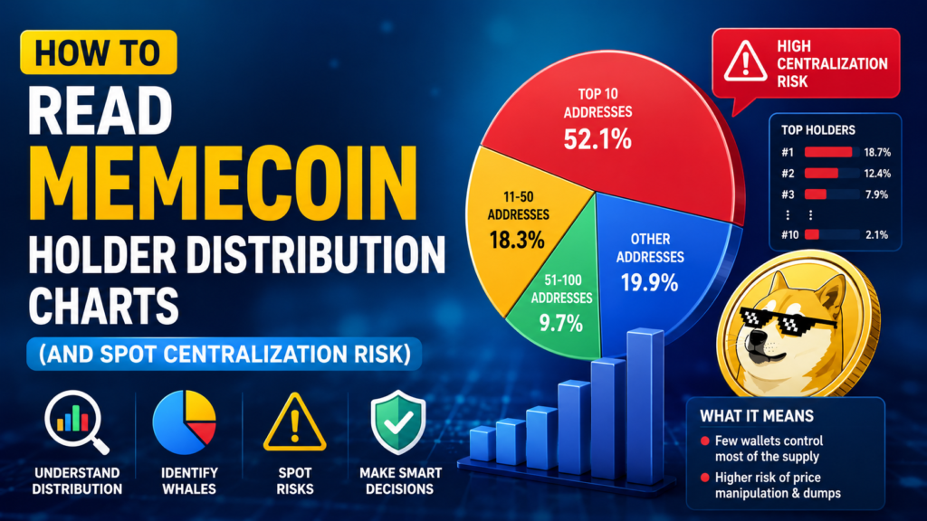
Layer 1: Top Holder Concentration
The most immediately visible metric is what percentage of total supply the top 10, 20, or 50 wallets hold. This raw concentration figure is your first filter. Here’s the threshold framework that experienced on-chain traders apply:
- Under 25% in top 10 wallets: generally tradeable. Individual positions are manageable, and no single coordinated exit can take out the market.
- 25–40% in top 10 wallets: proceed with caution. This level of concentration means the top holders, if coordinated, could create significant sell pressure. Position sizing should reflect this.
- Above 40% in top 10 wallets: serious risk flag. This is not automatically a rug some legitimate projects have concentrated early holdings but it requires the deeper checks before any capital commitment.
It is worth noting that the liquidity pool wallets should be separated from this calculation. A token where 18% sits in the LP and 22% is in organic holder wallets is fundamentally different from one where 22% is in an LP that the deployer controls and can drain at will.
Layer 2: Wallet Clustering and Connection Mapping
This is where Bubblemaps earns its reputation. The visual map converts individual wallet positions into bubbles and draws connecting lines between wallets that have transferred tokens to each other. Clusters of densely connected large bubbles are the visual signature of coordinated holder groups.
The key patterns to recognize:
- Star clusters: one central wallet with lines radiating out to multiple surrounding wallets. Classic deployer distribution the central wallet seeded all the surrounding ones, meaning they’re controlled by the same entity despite appearing as separate holders.
- Chain clusters: wallet A → wallet B → wallet C in sequence. Tokens passed down a chain of addresses to obscure the original source. Common in more sophisticated insider operations.
- Disconnected scatter: bubbles with no connecting lines to each other. This is the visual signature of organic, independent holders each wallet acquired tokens independently through DEX purchases rather than through inter-wallet transfers.
On Solana specifically, deployer wallet tracing is critical because the chain’s low fees make it cheap to operate dozens of wallets simultaneously. Many Solana memecoin rugs involve deployers managing 30 to 50 wallets that Bubblemaps will group and highlight if behaviorally connected.
Layer 3: The Bundle Buy Check
Bundling is one of the most common manipulation tactics in memecoin launches, especially on Solana. It refers to coordinated buying where multiple wallets purchase the same token in the same block or within the first few blocks of trading, before any public buyer has had a chance to enter.
Bubblemaps’ Bundle Checker quantifies this: it shows what percentage of the total supply was acquired through bundled transactions at launch. The thresholds that matter in practice:
- Under 5% bundled: normal. Some coordination at launch is expected and not inherently problematic.
- 5–20% bundled: elevated risk. A significant portion of supply was pre-positioned before retail access. Monitor, but don’t automatically reject.
- Above 20% bundled: serious concern. More than one-fifth of the token’s supply was captured by coordinated wallets at launch. These wallets bought before you had access and hold a significant cost advantage.
- Above 35% bundled: reject outright. The launch was structured to benefit insiders at retail’s expense. No price action or smart money signal overrides this level of pre-positioning.
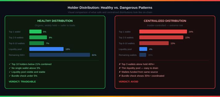
Visual comparison of healthy distribution (left) vs centralized distribution (right). Note the difference in top wallet concentration, liquidity pool depth, and the bundle check percentage. The healthy token shows organic spread; the centralized one has three wallets controlling nearly half the supply.
What to Check Beyond the Distribution Map
The holder distribution chart is the visual layer. Behind it are three additional checks that complete the picture.
Deployer Wallet Status
A deployer wallet that has renounced its tokens meaning it holds zero supply and has no further control over the contract removes a significant category of rug risk. A deployer that retains 3–10% of supply is not automatically a bad sign: teams need tokens for development and liquidity. But a deployer that retains supply without disclosure, or that appears as a whale in the holder list under a disguised address, is a serious red flag.
Trace the deployer address through its transaction history. Does it have a pattern of launching tokens and then selling into pumps? Has it funded multiple other wallets that also hold this token? Arkham Intelligence and Etherscan are the most effective tools for this forensic work.
Liquidity Pool Health
A token can show clean holder distribution and still collapse immediately if the liquidity pool is too thin. The LP percentage what fraction of total supply is held in the DEX liquidity pool tells you how much cushion exists between buying pressure and price impact. Under 8% in the LP means the pool is thin enough that a moderate sell of even one top holder could drop the price dramatically. A healthy LP holds 15% or more of total supply and has been burned (locked permanently) rather than remaining withdrawable by the deployer.
Time Travel: Watching Distribution Change
Bubblemaps’ Time Travel feature reconstructs how a token’s holder map looked at any historical point. This dynamic view is often more revealing than the current snapshot. If the top cluster of wallets has been gradually shrinking tokens moving out to exchange deposit addresses that is a real-time distribution signal. The insiders are selling. If the same cluster has maintained its position for months, the token may have genuine holding conviction at the top. Watching how distribution evolves over time turns a static data point into a behavioral story.
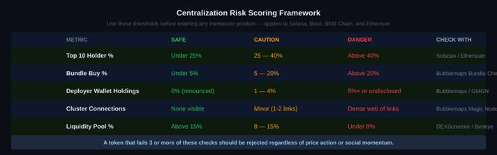
Centralization risk scoring framework five key metrics with safe, caution, and danger thresholds. A token failing three or more of these checks should be rejected regardless of price momentum or social narrative.
The BRETT Exception And Why It Doesn’t Change the Framework
Experienced traders will point to tokens like BRETT on Base, which launched with notable insider concentration but went on to reach a market cap above $1 billion with over 889,000 holders. Bubblemaps analysts noted that BRETT and PEPE are the exception, not the rule, emphasizing how aggressive speculation masked underlying concentration risks in both cases.
The existence of exceptions does not invalidate the framework. It modifies the probability distribution. A token with 40%+ concentration in connected wallets has a low expected value trade even if it occasionally produces a 10x. The distribution check is not about finding certainty it is about finding asymmetric risk. Tokens with clean distribution fail sometimes. Tokens with dangerously concentrated distribution fail most of the time. The math favors the clean distribution, and position sizing should reflect that.
BRETT and PEPE succeeded despite structural risks because of exceptional community momentum and timing. The correct lesson is not that concentration risk can be ignored. It is that when you ignore it and survive, you got lucky.
Building Distribution Analysis Into Your Research Workflow
Holder distribution analysis is most valuable as a rejection filter, not a buy signal. It does not tell you which tokens to buy. It tells you which tokens to remove from consideration before anything else price action, smart money signals, or social momentum influences the decision.
The practical workflow: run DEXScreener or GMGN to surface tokens with momentum. Run Bubblemaps bundle checker on anything that passes the initial filter. Check the top holder concentration and deployer wallet. Verify LP health. This four-step sequence takes under two minutes per token and eliminates the vast majority of manipulated launches before any capital is committed.
The Two-Minute Check That Changes Everything
The most important habit a memecoin trader can build is not finding better signals. It is rejecting bad tokens faster. Holder distribution analysis is the fastest, most reliable rejection filter available because it is based on verifiable on-chain data that cannot be faked, paid for, or gamed by marketing.
A token with a dense cluster of connected wallets holding 45% of supply will show you that in 30 seconds on Bubblemaps. A bundle check above 25% will appear in the same view. Liquidity pool percentage is a single number on DEXScreener. None of this requires advanced analysis. It requires the habit of checking before committing.
The traders who consistently avoid catastrophic losses in memecoin markets are not smarter or luckier. They built a non-negotiable pre-entry checklist and they run it every single time. Distribution analysis is step one of that checklist. Not step three. Not a nice-to-have. Step one.